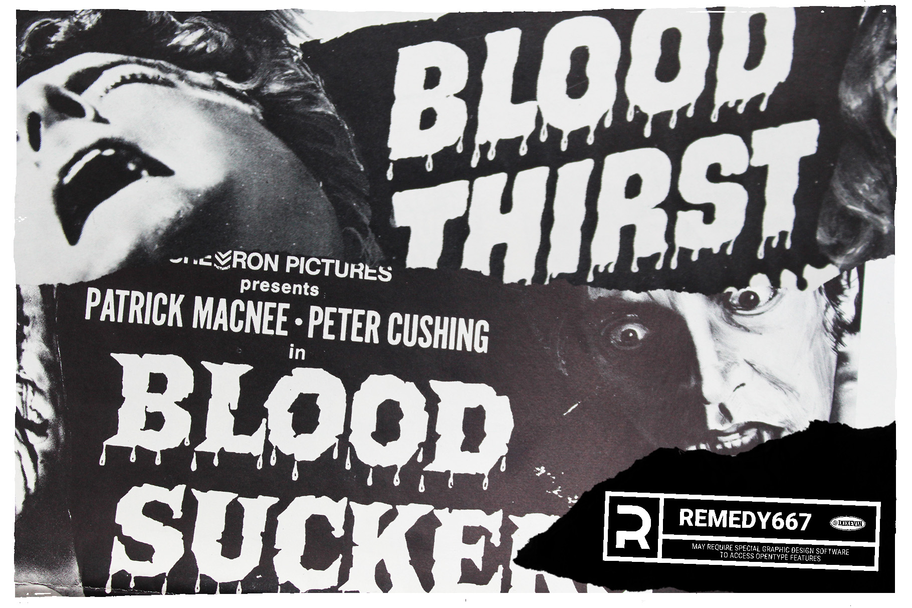
For a while I’ve been collecting movie posters. They’re a great reference if you’re looking for a very large specimen of type. Often times, when I photograph pieces of lettering from catalogs or magazines you get a jagged effect from the half-toning. Theoretically, if your sample is bigger, then you have less chance of that finding it’s way into your typeface.
A few months ago I had purchased a couple of poster lots that had interesting lettering, and I figured I could make some cool fonts. So, you unfold them and take a picture, and fold them back up. Then you put them in a box or envelope with a pile of other posters. You forget where they are. You forget what you have. Terrible problems I know.
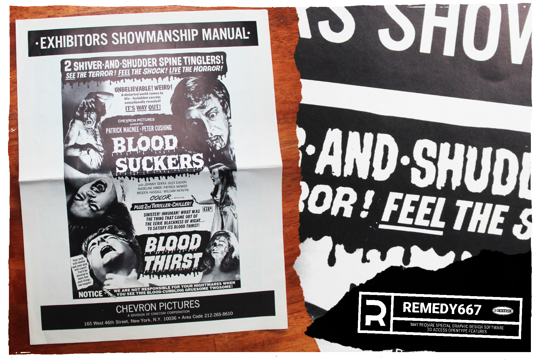
I had a few press books in the past that I picked up over the years. Then I figured that because the way they’re printed, usually in strict black & white in the center. Because they contained ads that had to be put on plates for printing in newspapers. Usually, outside of any imagery, the lettering was typically unphased (sp?) by any halftone effect or outside interference.
A nice clean type sample to start from.
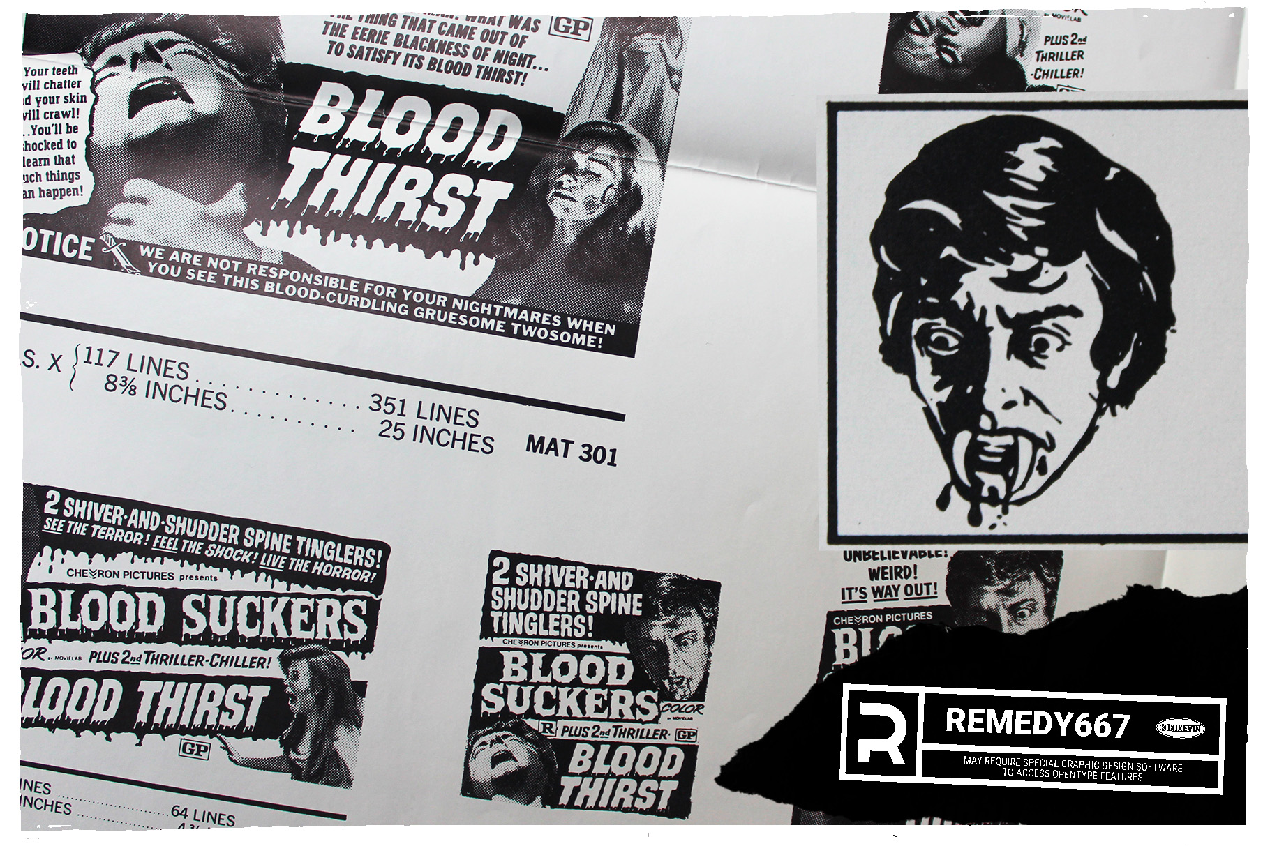
Also, you get double features, and different versions of titles. So, there’s a lot more interesting lettering to choose from. They fit on a scanner (when folded), which can further reduce distortions. I can pull out a press book and easily start looking through it.
Also, they’re cheaper than posters.