
This is a weird concept that got brought about in a conversation I was having with Roel Niskens about different OpenType features, and how they could be used to make a typeface more versatile… or perhaps, better yet, customizable for the end user.
Every once in a while the concept of ligatures comes up. In the past, I’ve made a lot of fonts with extra (even excessive) discretionary ligatures, and I feel that they can add to the value of the font being sold commercially. I’ve even bought fonts based on such features myself. However, there are a few things that kinda suck about ligatures.
They don’t respond well (or at all) to tracking or kerning changes.
If you want to track out your spacing, or even tighten it up a bit, the ligatures aren’t having any of that. They’re set. Think of them as their own letters. Even if they’re 2 interlocking pieces, it’s like the dot (tittle) on a lowercase “i”. That shit ain’t movin’.
However, I was looking through some old type specimens, and came across this typeface, Toronado Interlock.
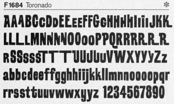
It got me thinking about how these extended and inverted letters fit into each other. As lockups, interlocks or whatever you want to call them. In a lot of modern fonts that you find (on Creative Market for example) a lot of people would refer to the finished character as a ligature.
Argue that name all you want, it’s like font vs typeface. Even if they don’t actually connect, if they’re combined into one glyph, they’re a ligature.
Why though, do they have to be in one glyph? You end up reusing a lot of the same shapes over and over when developing a typeface, and they can theoretically become over complicated pretty quickly. Would it then make more sense to use the interlocking idea? Simply create an alternate set version of a glyph, and instead of using substitutions in your ligature feature to call the combined glyph, why not substitute out both of the glyphs for the individual new characters?
So, instead of this:
sub t h by th.liga;We do this:
sub t' h by t.ligal; sub t.ligal h' by h.ligar;That tracks. Literally.

So, you can now have the option of adjusting the space between the letters that make up your ligatures. Allowing for more evenly spaced type. Then an interesting, and somewhat unexpected, thing happens. Because we are no longer working with actual ligatures, we have alternate versions of letters that can be combined in ways that were not initially intended.
Play along for yourself:
Cosmic Monsters

Learn more about the making of our typeface, Cosmic Monster. Watch this video on YouTube of Nick drawing out the initial character set in Illustrator.