Ever buy a font that looks really cool, only, once you get it installed you notice that you have no idea where those special glyphs and alternate characters that you saw in the title cards went? Well, today I’m going to help you achieve your typography dreams. Adobe Photoshop 2025 In Adobe Photoshop there are 2 ways that you can find these special characters. The Character Menu and the Glyphs Menu. Character Menu The Character Menu can be found under: Window > Character. Once opened, you can see things like the font family, style, size, etc., and just below the center of this menu are a bunch of capital T’s, and a bunch of symbols. Those symbols are buttons that you can use to turn on (or off) certain OpenType features. This can be useful to universally apply things (like ligatures) to your text, without having to find a specific… read more
Type Design

Where did it come from? In 2019 I made up my own drawing challenge to coincide with the other popular October drawing challenges on Instagram. I followed the prompt list for Inktober but made up film titles from the prompts, writing them out in different “fonts” that I could make. I started the project in August by tracing out, I want to say, 45 different alphabets. I would then trace over letters to create words, so I was still creating something new each day on that day. Barth was one of those 45 alphabets.
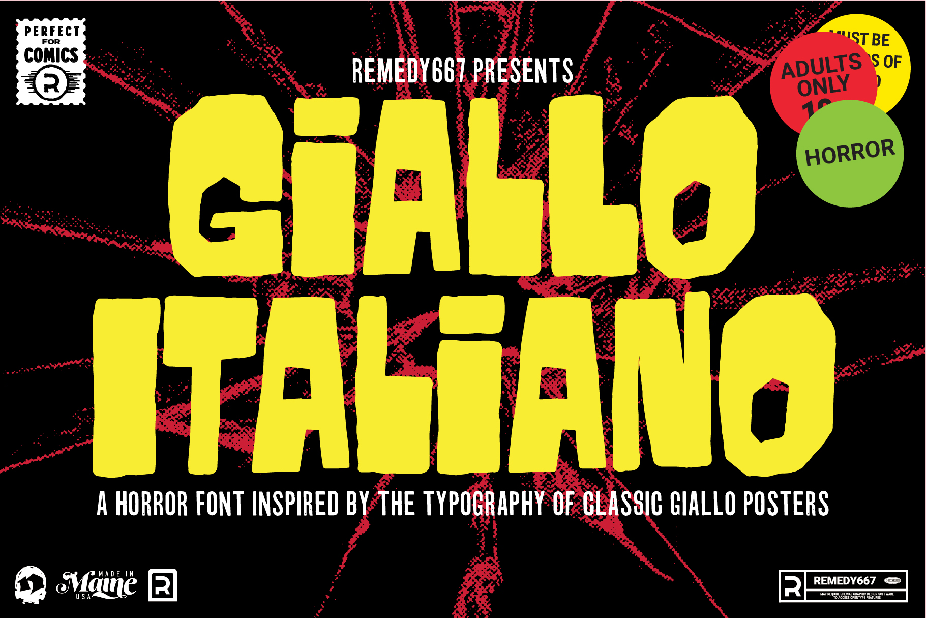
A Bit of Background Earlier this year I had been on a kick of watching Giallo films or having them on in the background and listening to their soundtracks. During this time, I was also seeing a lot of the film posters come up in my Pinterest feed. I had seen Giallo posters in the past with a much cleaner look, but in my mind, the hand-drawn lettering was much more interesting. It also seemed to work better with the paintings, and for the time, did a beautiful job uniting the film and soundtrack as a well-unified piece of artwork.
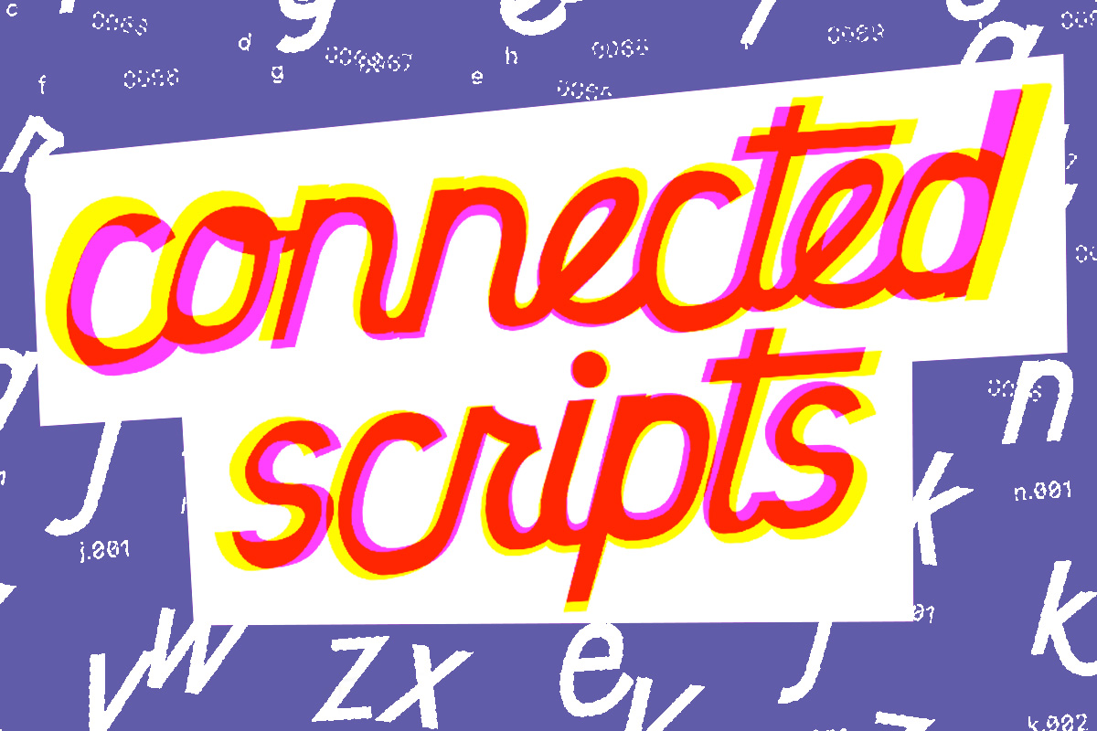
So, I’ve been building typefaces for a while now, but I’ve never made a serious (or even a half-hearted) attempt to create a connected script. I’ve had it explained to me several times, watched videos on YouTube and Skillshare, and even paid for some online lessons. Whether it was because I was too disengaged or for some other reason, the information never “took.”