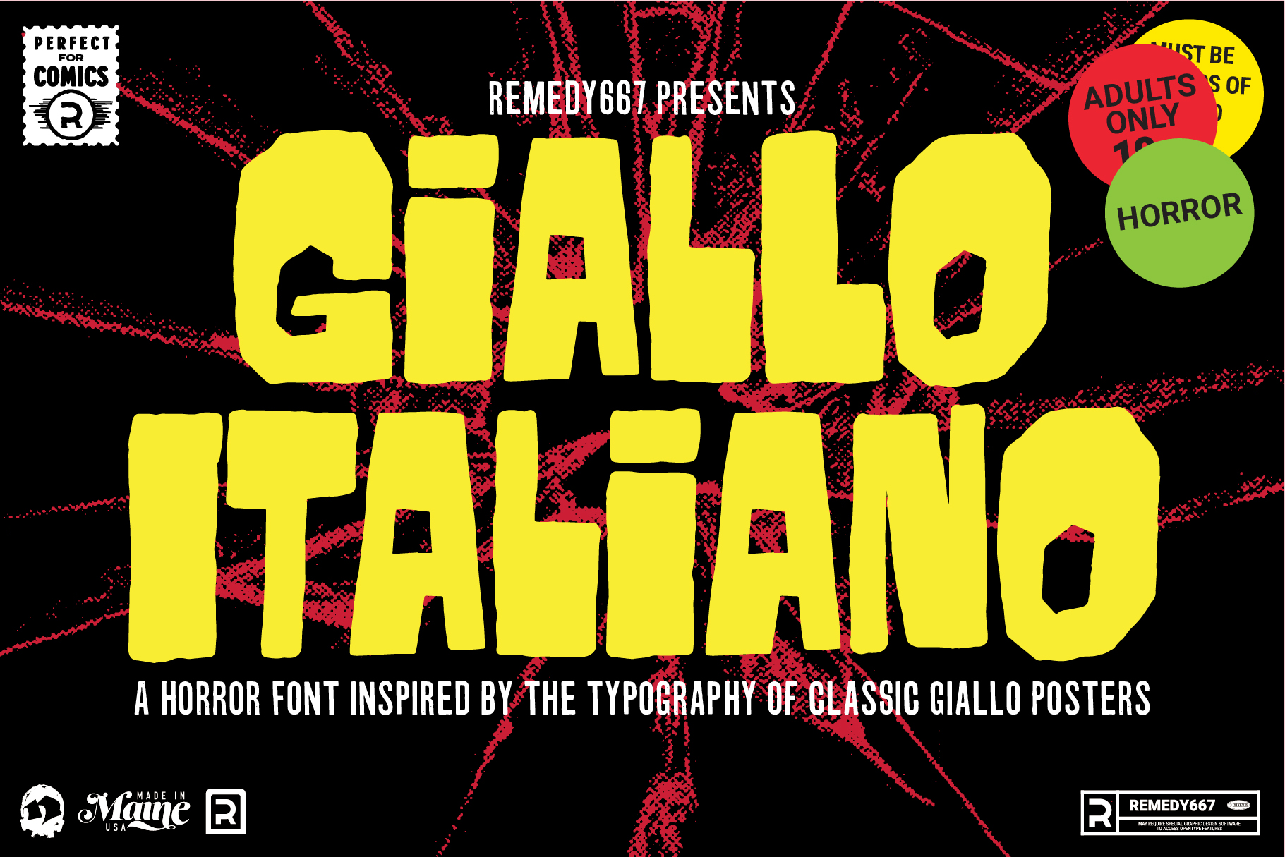
A Bit of Background
Earlier this year I had been on a kick of watching Giallo films or having them on in the background and listening to their soundtracks. During this time, I was also seeing a lot of the film posters come up in my Pinterest feed. I had seen Giallo posters in the past with a much cleaner look, but in my mind, the hand-drawn lettering was much more interesting. It also seemed to work better with the paintings, and for the time, did a beautiful job uniting the film and soundtrack as a well-unified piece of artwork.
Looking at Film Posters
When I first started this project back in May, I had been looking at a lot of Giallo film posters from the 1970s. Two posters in particular that caught my attention were “L’occihio nel Labririnto” and “Cosa Avete Fatto a Solange?” (English titles: Eye in the Labyrinth and What Have You Done to Solange?). I was really drawn in by the title case letters, on the slightly uneven baseline made from straight lines that slightly bowed from hand-drawn edges.

Both of these posters were from 1972 films and both are credited as being made by Sandro Symeoni. Unfortunately, my research couldn’t tell me if he had also done the layout, lettering, art direction, or just the paintings. I’ve also seen similar styles of type on posters by other artists, which leads me to believe it could have been some sort of template, or style of lettering that was popular at the time. If you look at other posters, for example, “Cara Dolce Delilah… Morta” (pictured below, English title: Dear Dead Delilah), which features a similar typeface, you can see that the type is a lot cleaner but doesn’t accomplish the task of unifying the artwork as well as the Symeoni posters, pictured above.

Component Type Design
Also, at this time I had been practicing with a different way of designing typefaces that I will call Component Type Design. Basically, I start with a collection of shapes that I can build letters and numbers and eventually an entire typeface. Because there are only a few shapes, it gives a lot of consistency between letterforms. Another benefit is that it offers the ability to expand the typeface in the future while maintaining the same style and energy from when it was originally made.
I have a few more fonts that use this same process for composing a typeface, but only one of them, Grase, has been released so far. So, expect more typefaces developed using this method in the future, and perhaps a better explanation of the process.
Check it out
Our newest typeface, Giallo Italiano is available now in our shop.