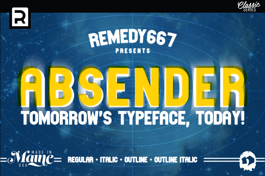
Seven years ago, the brave folks at Remedy667 released a typeface that would become their most downloaded to date, Absender. Originally released in the spring of 2011, Absender, was designed as a mono-spaced display typeface. We speak briefly with its creator, Nick Polifroni, about the font.
What inspired you to make Absender?
”I originally made it for a logo I was working on. So it was just a few letters and I liked it enough to expand it into the set that I put on daFont back when it was initially released.”
Did you ever plan on adding to it?
“At the time I was working on Glasket, so I was interested in making fonts that had lowercase sets. I don’t think I’d ever done that at the time this was released. 52 characters just seemed like a lot to make back then, which seems a little funny now.”
What made you decide to release a new version, and what’s different?
”I made the initial release in Fontlab, which seemed very complicated and I was trying to teach it to myself. I was never fully satisfied with the daFont version because it had a lot of weird errors like the dollar sign had gaps, and the G, S and 5 were just weird. There are a lot of points that need deleted. I just didn’t feel like it was finished. There were a lot of things that I’d wanted to do with it over the years like different weights and variants, I just wasn’t sure how to go about it.“
”Once I heard about Glyphs, and started using that I was pretty excited to get back into it. So I built it again from scratch, and added an Italic set as well as outlines. I fixed a lot of the characters I was unhappy with, but also kept some of the originals as alternates in case people wanted them. I also added some diacritics for multilingual support.”
Do you have plans for any more updates or releases for Absender in the future?
”I’m currently working on a rounded version of it, so we’ll see how that goes. It’s more of a passion project at this point, I feel like it’s been a free font for so long that people aren’t as interested in buying a commercial license for an expanded version. I’m still interested in working on it though. I’m always finding things I’d like to tweak or fix in my typefaces. I’d eventually like to resurrect more of the typefaces I published on daFont back then.”
Anything you’d like to add before we go?
”Just that I’m always looking for new ways to make my typefaces better, people can email me remedy667@gmail.com if they find any errors or issues, or things they’d like me to add to my typefaces. Like any piece of art or design they’re never really finished, but with a typeface I can always add and fix things. I also like seeing pictures of my typefaces in use, so send me that stuff as well.”
You can purchase the Pro version of Absender from Creative Market, or Creative Fabrica. The free version is still available through daFont.
