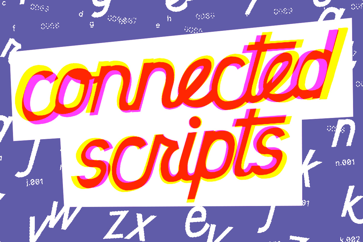
So, I’ve been building typefaces for a while now, but I’ve never made a serious (or even a half-hearted) attempt to create a connected script. I’ve had it explained to me several times, watched videos on YouTube and Skillshare, and even paid for some online lessons. Whether it was because I was too disengaged or for some other reason, the information never “took.”
I’ve never quite gotten the hang of how connected scripts work, and they didn’t appear to be something I’d ever be able to use. Every time I use them in a design, my clients either can’t read them or have a profound dislike for what they label “cursive” typefaces. Connected scripts, however, have always piqued my interest.
So Then…
I had the pleasure of participating in a Zoom session with Laura Worthington last week, where she explained some of her approaches for developing these types of fonts… Something finally made sense.
Now, I’m not going to try to describe anything that finally made sense to me because I hardly get it myself. What I can say is that I now have a much better notion of how I may incorporate some of these concepts into my present font design style. Future typefaces and revisions will be really exciting.
So, with all of that stated, I’d simply like to give a couple of my initial thoughts on what I’ve been doing with this newfound information. Keep in mind that these are all pretty easy and straightforward… It’s almost as if I’m relearning how to do this, therefore it might take a while before you start noticing connected scripts in my work.
Example 1
My second effort at a connected script font is The Point of No Return. Basically, I started with the notion of making a manuscript typeface and then added connection parts to give it a distinct vibe. It reminds me a lot of my early fonts, such as Asymek and Glasket, which are both turning ten this year.
My initial effort was more italic or slanted… However, because I did everything by sight and without using any guides, it’s not particularly even.
Example 2
So, this is only the beginning of what might be a wonderful thing. I’m not sure what will come of these two scripts that I’m experimenting with (if anything), but it’s all an intriguing, new process for me… so I thought I’d share.
Thank you for taking the time to read this, and I hope to hear from you soon.


