This is a weird concept that got brought about in a conversation I was having with Roel Niskens about different OpenType features, and how they could be used to make a typeface more versatile… or perhaps, better yet, customizable for the end user. Every once in a while the concept of ligatures comes up. In the past, I’ve made a lot of fonts with extra (even excessive) discretionary ligatures, and I feel that they can add to the value of the font being sold commercially. I’ve even bought fonts based on such features myself. However, there are a few things that kinda suck about ligatures. They don’t respond well (or at all) to tracking or kerning changes. If you want to track out your spacing, or even tighten it up a bit, the ligatures aren’t having any of that. They’re set. Think of them as their own letters. Even if… read more
Fresh Cuts
For a while I’ve been collecting movie posters. They’re a great reference if you’re looking for a very large specimen of type. Often times, when I photograph pieces of lettering from catalogs or magazines you get a jagged effect from the half-toning. Theoretically, if your sample is bigger, then you have less chance of that finding it’s way into your typeface. A few months ago I had purchased a couple of poster lots that had interesting lettering, and I figured I could make some cool fonts. So, you unfold them and take a picture, and fold them back up. Then you put them in a box or envelope with a pile of other posters. You forget where they are. You forget what you have. Terrible problems I know. I had a few press books in the past that I picked up over the years. Then I figured that because the… read more
Ever buy a font that looks really cool, only, once you get it installed you notice that you have no idea where those special glyphs and alternate characters that you saw in the title cards went? Well, today I’m going to help you achieve your typography dreams. Adobe Photoshop 2025 In Adobe Photoshop there are 2 ways that you can find these special characters. The Character Menu and the Glyphs Menu. Character Menu The Character Menu can be found under: Window > Character. Once opened, you can see things like the font family, style, size, etc., and just below the center of this menu are a bunch of capital T’s, and a bunch of symbols. Those symbols are buttons that you can use to turn on (or off) certain OpenType features. This can be useful to universally apply things (like ligatures) to your text, without having to find a specific… read more

Where did it come from? In 2019 I made up my own drawing challenge to coincide with the other popular October drawing challenges on Instagram. I followed the prompt list for Inktober but made up film titles from the prompts, writing them out in different “fonts” that I could make. I started the project in August by tracing out, I want to say, 45 different alphabets. I would then trace over letters to create words, so I was still creating something new each day on that day. Barth was one of those 45 alphabets.

Hi! You may have noticed some new layouts, graphics, and pages around. The website is our pride and joy so we’ve been really active in changing things up lately! If you have any feedback or suggestions for changes please let us know. What You Can Expect There have been a lot of noticeable changes around here, the homepage and blog have undergone quite a change in appearance. Most of these changes are to try and help with the overall usability of the site, and some of the changes I’ve actually been wanting to make for a while, and just hadn’t had time for. Then there are some other changes… New Features You may have noticed there are some new logos on the home page and on a few of the individual font pages in their features sections. I’ve been using a lot of these terms (Doubles Elimination, Randomizer) over the… read more
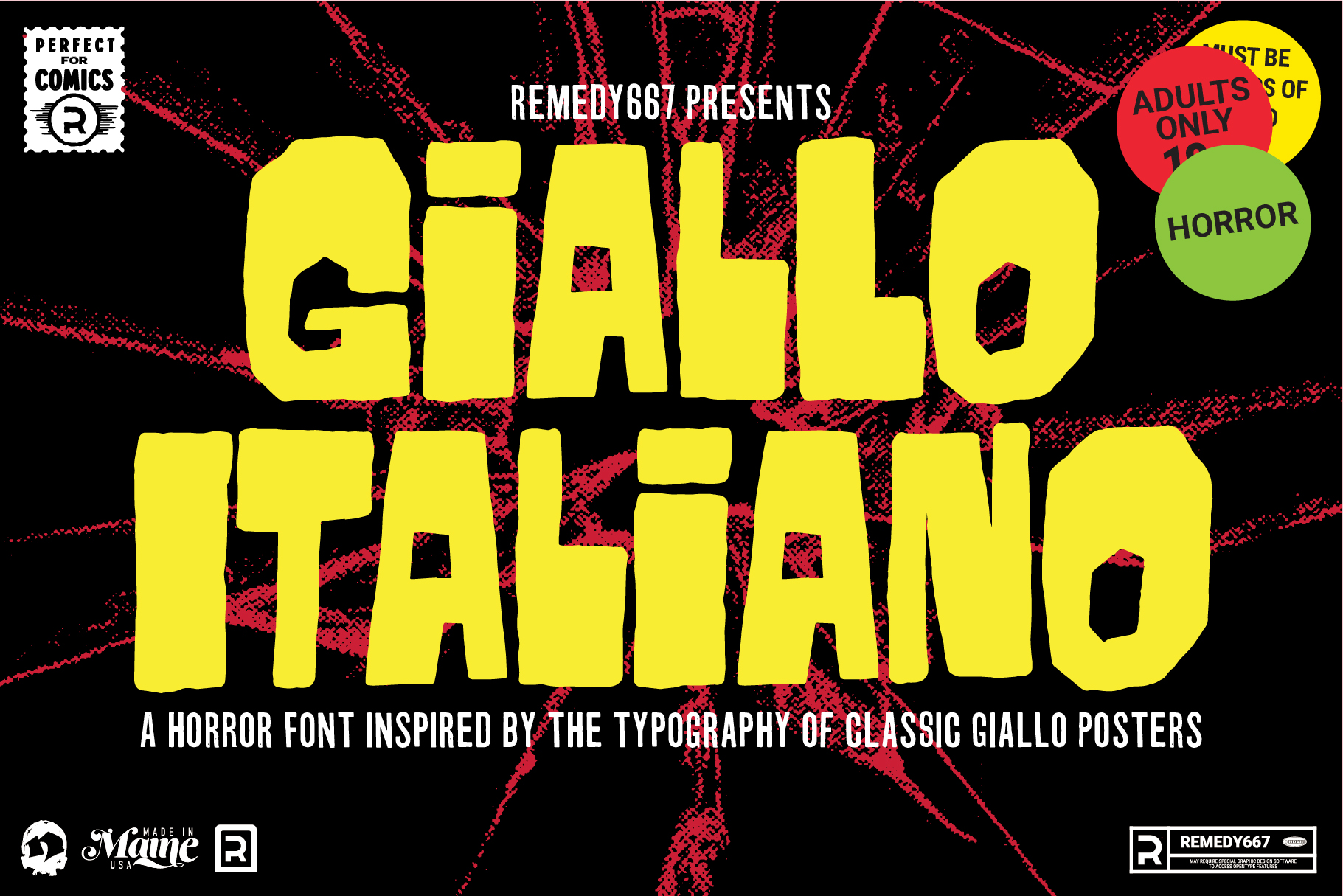
A Bit of Background Earlier this year I had been on a kick of watching Giallo films or having them on in the background and listening to their soundtracks. During this time, I was also seeing a lot of the film posters come up in my Pinterest feed. I had seen Giallo posters in the past with a much cleaner look, but in my mind, the hand-drawn lettering was much more interesting. It also seemed to work better with the paintings, and for the time, did a beautiful job uniting the film and soundtrack as a well-unified piece of artwork.
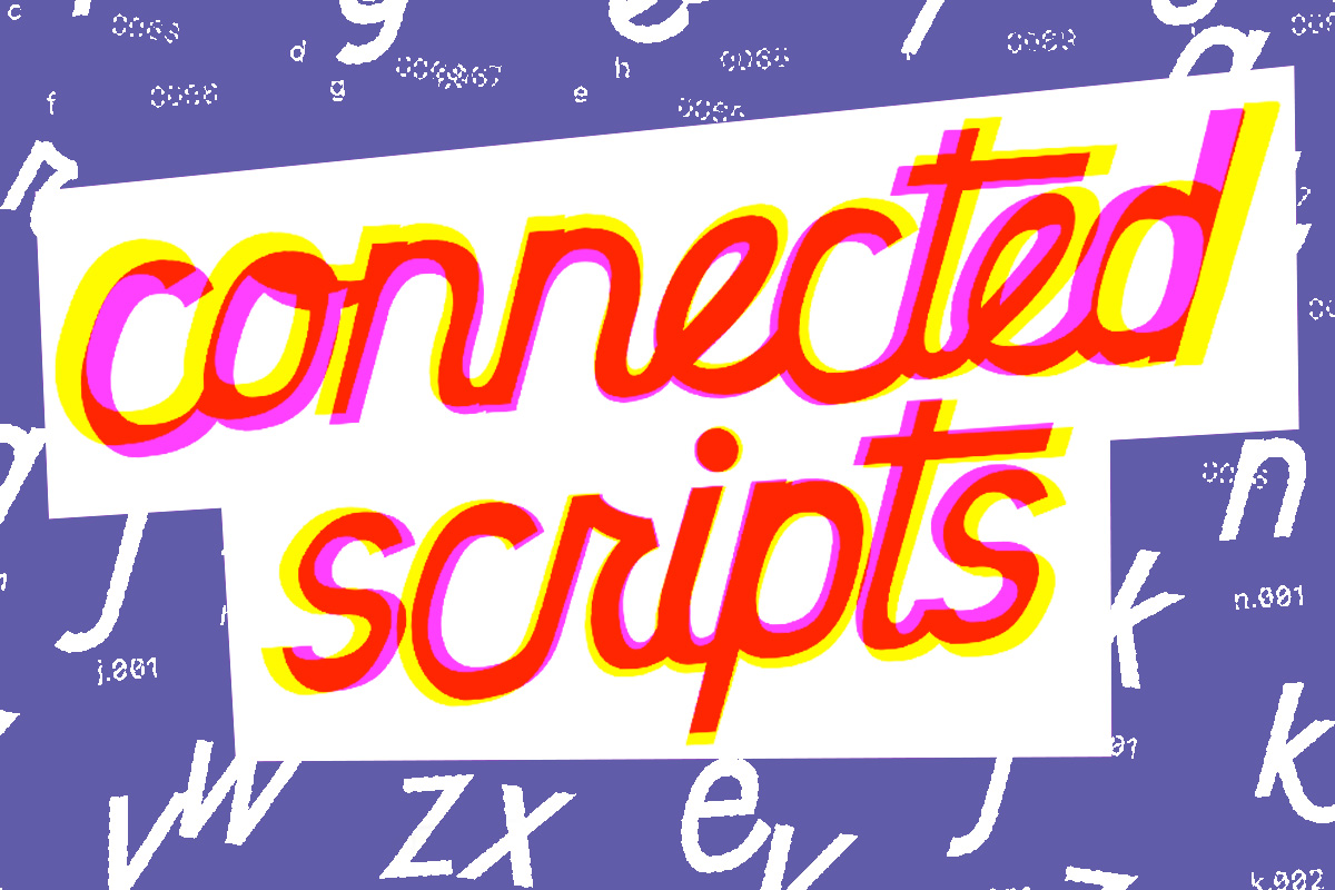
So, I’ve been building typefaces for a while now, but I’ve never made a serious (or even a half-hearted) attempt to create a connected script. I’ve had it explained to me several times, watched videos on YouTube and Skillshare, and even paid for some online lessons. Whether it was because I was too disengaged or for some other reason, the information never “took.”
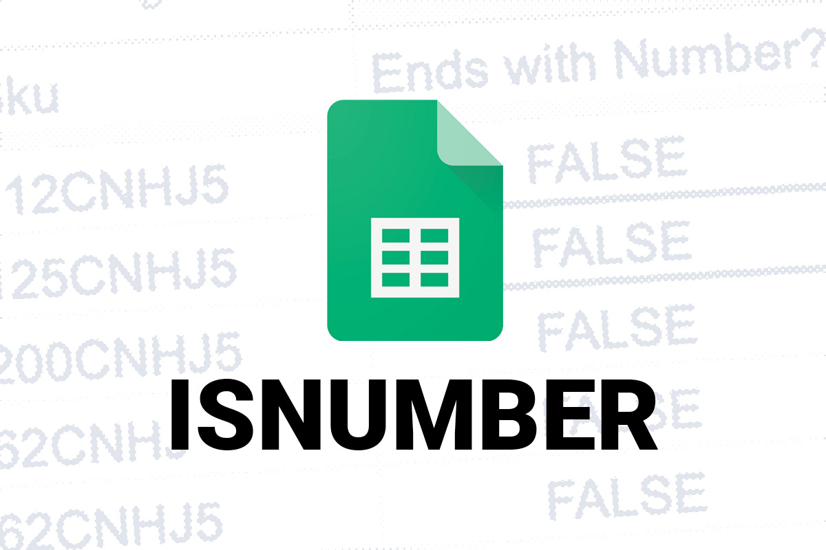
Recently, I tried to build a formula in sheets to tell me whether or not a character in a specific position of a string was a number or not. Turns out that none of them were? Even though, plain as day… there they are. Numbers.
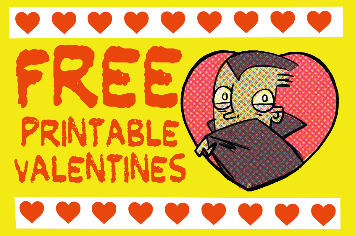
Happy Valentines Day! Instead of buying Valentines, use these monster printables for FREE! They even come in a small batch quantity of 5 per page, perfect for small classrooms, or at-home learning… or, download them as individual jpegs to post on your friends’ social media pages.
So, I do a lot of editing website data and HTML in Google Sheets. A lot of the time it’s a lot of old stuff that someone else populated, sometimes it’s been extracted from a vendor website, and it’s almost always in need of some sort of repair.